
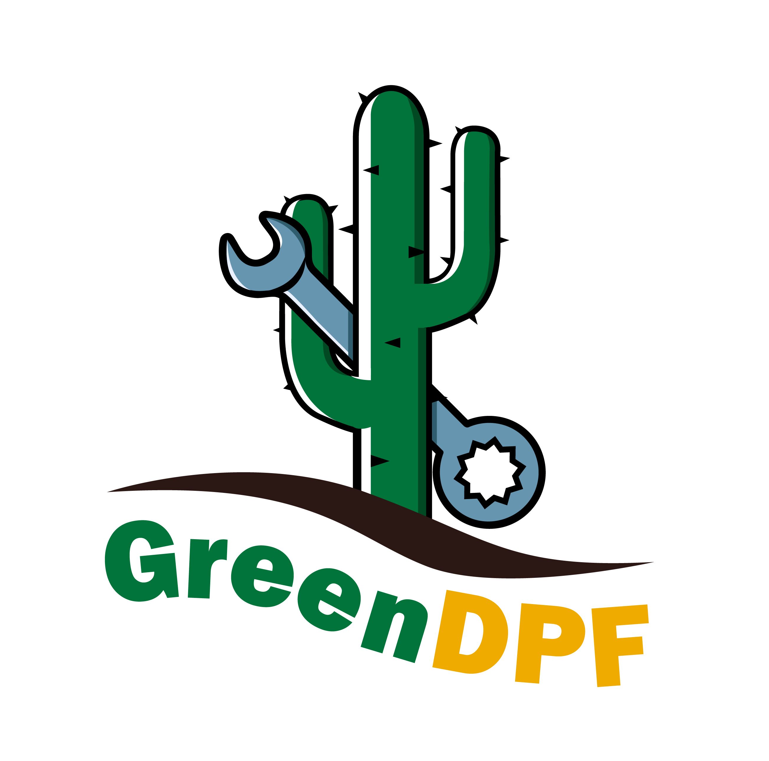
Logo Design for GreenDPF
Client Background:
GreenDPF is an eco-friendly digital solutions provider specializing in sustainable practices for the digital world.
Initial Assessment:
- Analyzed the existing logo for strengths and weaknesses.
- Identified the need for a design that symbolizes both environmental consciousness and digital innovation.
Research and Inspiration:
- Explored eco-friendly color palettes, drawing inspiration from nature and technology.
- Researched industry trends to ensure the new logo aligns with contemporary design standards.
Conceptualization:
- Brainstormed ideas to merge elements of nature (greenery) with digital symbols (bits, pixels).
- Developed initial sketches and digital drafts to visualize potential concepts.
Typography Exploration:
- Explored fonts that balance a tech-forward appearance with an eco-friendly feel.
- Prioritized legibility and scalability for various platforms and applications.
Color Palette Selection:
- Chose a harmonious blend of green shades to evoke environmental consciousness.
- Incorporated accent colors for a modern and dynamic touch.
Iconic Symbolism:
- Crafted a unique icon combining a stylized leaf with subtle digital elements.
- Ensured the icon is versatile, recognizable, and scalable.
Feedback and Iterations:
- Presented initial concepts to the client for feedback.
- Incorporated client input to refine the chosen concept, ensuring alignment with the brand's vision.
Final Design:
- Delivered a finalized logo that encapsulates the fusion of sustainability and digital innovation.
- Provided the client with various file formats for seamless integration across digital and print media.
Brand Consistency:
- Outlined guidelines for consistent logo usage to maintain a cohesive brand identity.
- Ensured adaptability for future branding needs and expansions.
Outcome:
- The redesigned GreenDPF logo successfully communicates the brand's commitment to sustainable digital progress.
- Positive feedback received from the client and stakeholders.
Conclusion:
Techpranee Digital Agency's logo redesign for GreenDPF reflects a strategic blend of eco-consciousness and technological advancement, contributing to a stronger and more memorable brand identity.